
Welcome and Thanks for Visiting!
I hope you got lots of good tips and info from the podcast episode! Click the button above to schedule your free 30 minute consultation to talk about ways to improve your website.
Once you're on my calendar, scroll down for some more tips.
Three Things To Fix So Your Website Isn't Terrible
Load Time

Load time is one of those things that you can take for granted if you have high speed internet. It’s something you forget about until you are trying to login from a gas station off a back highway or you’re in some remote airbnb where your only internet options are DSL or 3G. But in reality, there are plenty of people (meaning potential and actual customers) that have slow internet all the time. Even if it’s not DSL, if they have a 10Mbit connection, that can still get bogged down if they are on a shared line (which is very likely) or if someone in the other room is on a video call. Then they’re going to YOUR website and blaming YOU that they have to wait for the page to come up.
Obviously we don’t want that, so it’s in your company’s best interest to do what you can to speed up the load time. Otherwise, people bounce. They give up waiting and sometimes don’t come back later. So spend the time and effort to make sure your site loads quickly, even on a slow connection.
You can use tools like GTMetrix or Google Page Speed Insights to get an idea of where you stand and some specific things to fix. And before the web developers get mad at me, I do want to clarify that those tools are very helpful, but it should not be your goal to get a score of 100 on every test. Sometimes it’s not feasible for your site to make all of the recommended changes, due to the nature of the design or functionality. And that’s okay. But at the very least, it can give you ideas for specific items to look at for improving page load times.
Some examples might be resizing and optimizing your images, pre-loading some requests, or making sure your server is compressing your files. There are more that I discuss on Facebook and Instagram now and then. For now, just know that it’s important to have your site load reasonable quickly. Because frustrated people don’t usually become customers. And it’s actually worse than that, because Google has started using page speed as a ranking metric. So if you and your competitor have equivalent sites, but theirs loads faster — guess which site will be ranked higher in the search results? That’s why this is something I focus on for my website maintenance clients, I help them keep their site optimized and loading quickly.
Just in case you are someone who gets carried away sometimes, let me remind you that the goal of your website is not to show people how clever you are. Sometimes you might get so excited by nifty little animations or sliders or whatever the latest web trick is, and you just have to use it! Even if it doesn’t make sense, and even if it makes things harder or more annoying for your visitors.
Ask yourself two questions: Why are people coming to my website? What do I want these people to do on my website?
If people are coming to your website to make an appointment, but there’s no button at the top that says “make an appointment” then you just found an opportunity for improvement. Don’t make people scroll scroll scroll to find something simple. Don’t make them wait for five slides before seeing the thing they need.
Missing or Hidden Items

Sadly I see this a lot when I do website reviews.
These websites have sliders with stock photos that aren’t adding any value to the visitor. It’s just a waste of space and load time. Be intentional about the elements on your page, don’t just use them because they were in the template.
Generally my advice for sliders is: don’t use them. Testing consistently confirms that they don’t work. People don’t wait around to look at all of the slides. And they are bloating your page by loading images that many times are never even viewed.
As for hiding or burying content, that’s probably not helping either. If you are ashamed to put your Pricing page in your menu, then you either need to revisit your pricing model or do a better job explaining why what you do is worth that price. But don’t hide it, hoping people won’t see it. That just makes people annoyed.
And it’s surprising how many times seemingly obvious things are missing from the menu. Just like in my opening example, is your wording consistent with your marketing? Do you actually have the proper options available that you are telling people to click on?
Now, I do realize it doesn’t make sense to put absolutely everything in your menu. There’s only so much space. So if you have a large website or e-commerce store with lots of categories and products, you can have landing pages for different areas of the site and just include those in the menu. Then on those landing pages you can list out the relevant sections people might be looking for.
Another approach is to just have the basics in the menu, and then add a search feature that actually works. For example, if your search function is case sensitive, that’s annoying and not helpful. People will leave your site because they think you don’t have what they are looking for, not realizing they should have capitalized their search query! So make it flexible and quick. And if their search has no results, be sure to include some suggestions of where to start!
Popups
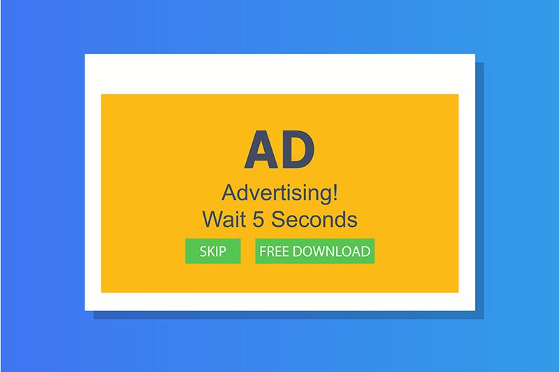
Raise your hand if you love popups. Anyone? As expected, most people don’t like them. They’re annoying, especially when you are trying to do something like read an article or find the menu link you need.
Popups can be used sometimes but they are frequently overused. Too many popups is a sure way to annoy a prospect or make them feel like you might be a scam.
If you are going to use a popup, offer something of value to the visitor. Don’t just say “Sign up for our newsletter!” Say something like “Sign up for our newsletter and get our FREE guide for how to _____ on a budget.” People won’t be as annoyed if they are being offered something of value.
I’d say typically don’t use more than one popup on a given page. And once someone dismisses a popup, don’t show it to them again for at least a week. One of my clients added a popup to his site and he made it so it came up on every page, every time. So I explained to him why that’s not ideal, and I changed it so that a user won’t see it more than once a week.
There’s something subtle going on here, because this lets the prospect know that you actually listen to your clients. You aren’t just going to constantly shout them down or upsell them every step of the way. A subtle message comes across that you value your customer.
Another thing I did for my client’s popup is to change the timing of when it came up. Don’t make your popup appear immediately, or even after a few seconds. Think about how you experience popups. When you go to a page, you start reading, and then BAM popup in your face. For my client, I looked at his page visit statistics and saw the average time people spend on a page on his site. Then I set the popup to come up about 70-80% of the way into that time. This gives people a chance to actually read the content on the page, which means when the popup does come up, you’re no longer interrupting. Now it’s more like bonus content or follow up material. And yes, you can set your popups to trigger based on percentage scrolled down the page instead of trying to estimate read time, since everyone reads at different paces.
So use popups sparingly, intentionally, and respectfully.